UI/UX Design
@Talkmeup
Designing an interpretable AI-Powered feedback experience
Now viewing
← Previous
AI with User-Centricity
Mapping a performance trajectory focused dashboard
Now viewing
Next →
Boosting Actionability
Timeline:
10 weeks
Tools:
Figma, FigJam, Zeplin
Deliverables:
Interactive prototype
Overview
Redesign of AI Feedback Report that:
translates behavioral and verbal signals into personalized performance analysis and training plan;
improve users' online communication skills with AI-generated traceable, actionable coaching
translates behavioral and verbal signals into personalized performance analysis and training plan;
improve users' online communication skills with AI-generated traceable, actionable coaching
Background
Turning score-based report to a coaching tool
TalkMeUp’s legacy report leaned on numeric scores and long transcripts, making it hard to connect why something happened to what to do next. We reframed it as a coaching tool: 30-second skim, traceable to video and transcript, immediately actionable, and transparent about model uncertainty, so busy professionals and managers can review, trust, and share with confidence.
STAKES
Why This Mattered?
Professionals don’t need more scores, they need a fast, trustworthy way to turn a meeting into next steps. Without that, feedback is ignored, practice is unfocused, and improvement stalls.
Outcome bar:
Cut review to a 30-second skim, raise usage of “Generate Alternative,” and show measurable improvement across key skills over time.
User's side
TMU's side

Outcome bar:
Review takes ~30–45 minutes, insights aren’t traceable to moments, and advice is generic—confidence and follow-through drop.

Product stakes
If feedback isn’t actionable and evidence-backed, AI looks like a black box. We must show “why,” suggest “what to say instead,” and expose uncertainty.

Manager Stakes
Manual synthesis doesn’t scale; inconsistent coaching quality and missed follow-ups hurt team performance.

Business stakes
Low report adoption risks churn and limits seat expansion; trust hinges on transparent, explainable AI.
Research Insights
What We Heard & How It Shaped the Design
Through interviews, prototype tests, and usage logs, we saw the same pattern: people don’t want more scores, they want fast, evidence-backed next steps. These insights led to a summary-first flow, clip-linked highlights, and one-click phrasing suggestions that turn review into action.
Technologies
How AI get involved
Busy professionals don’t need more scores—they need a fast, trustworthy way to turn a meeting into next steps. Without that, feedback is ignored, practice is unfocused, and improvement stalls.

DESIGN Principles
Actionable over abstract
Actionable over abstract
Always turn findings into concrete next steps and example phrasing, not generic tips.
Evidence-first
Evidence-first
Every claim must be traceable to a timestamped clip and transcript line, with a short “why flagged.”
Adaptive
Adaptive
Alternatives should adjust to role, audience, meeting type, tone, length, and goal.
Low Cognitive Load
Low Cognitive Load
Summary first; progressive disclosure keeps cognitive load low.
Confidence & control
Confidence & control
Expose model confidence, let users correct flags, and choose what to redact or share.
Paths to the moment
Paths to the moment
Multiple ways to navigate and always landing on the exact clip.
Accessible & inclusive
Accessible & inclusive
Readable visuals, keyboard/screen-reader support; avoid biased or prescriptive language.
Learning loop
Learning loop
Instrument outcomes and user feedback to continuously improve suggestions and guidance.
Two Ways to INtake
Quick wins from Summary, or a deep dive with evidence
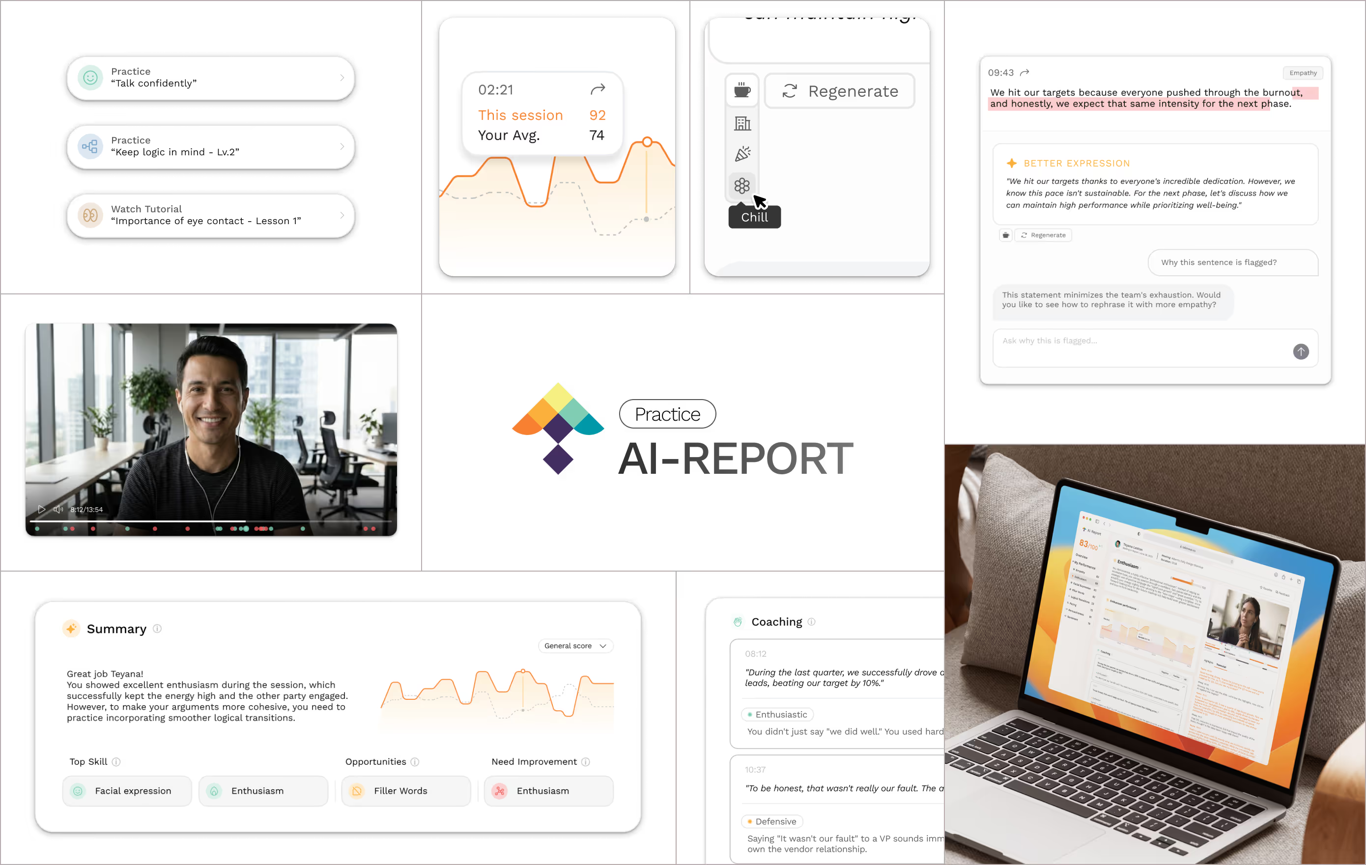
I designed the AI Feedback experience to support two distinct workflows. Users can act immediately from the Summary via suggested actions without leaving context. Or they can open a skill detail to review timestamped clips, verify why flags occurred, and check AI suggested retouching. Both flows keep evidence at hand, minimize hops, and log progress to reinforce practice.


Production preparation
From concept to production
Early tests showed the concept was right but the execution needed to be grounded in what we could reliably ship. I partnered closely with our ML and platform engineers to turn the idea into a feasible, observable slice of product.
We identified data usage issues that were not considered during the design phase. After determining our approach using practice data and AI prompts, the primary challenge of converting the design document into a shipable product was also resolved.
Final Design
Tested, Tuned, Shipped
We ran a beta with a working prototype to validate our model’s feasibility and collect feedback on the usability of the initial design. I incorporated those learnings, iterated, and locked the final version for production.

Core UPdates
Where I landed—and why it sticks
/01
Layout Rebuild
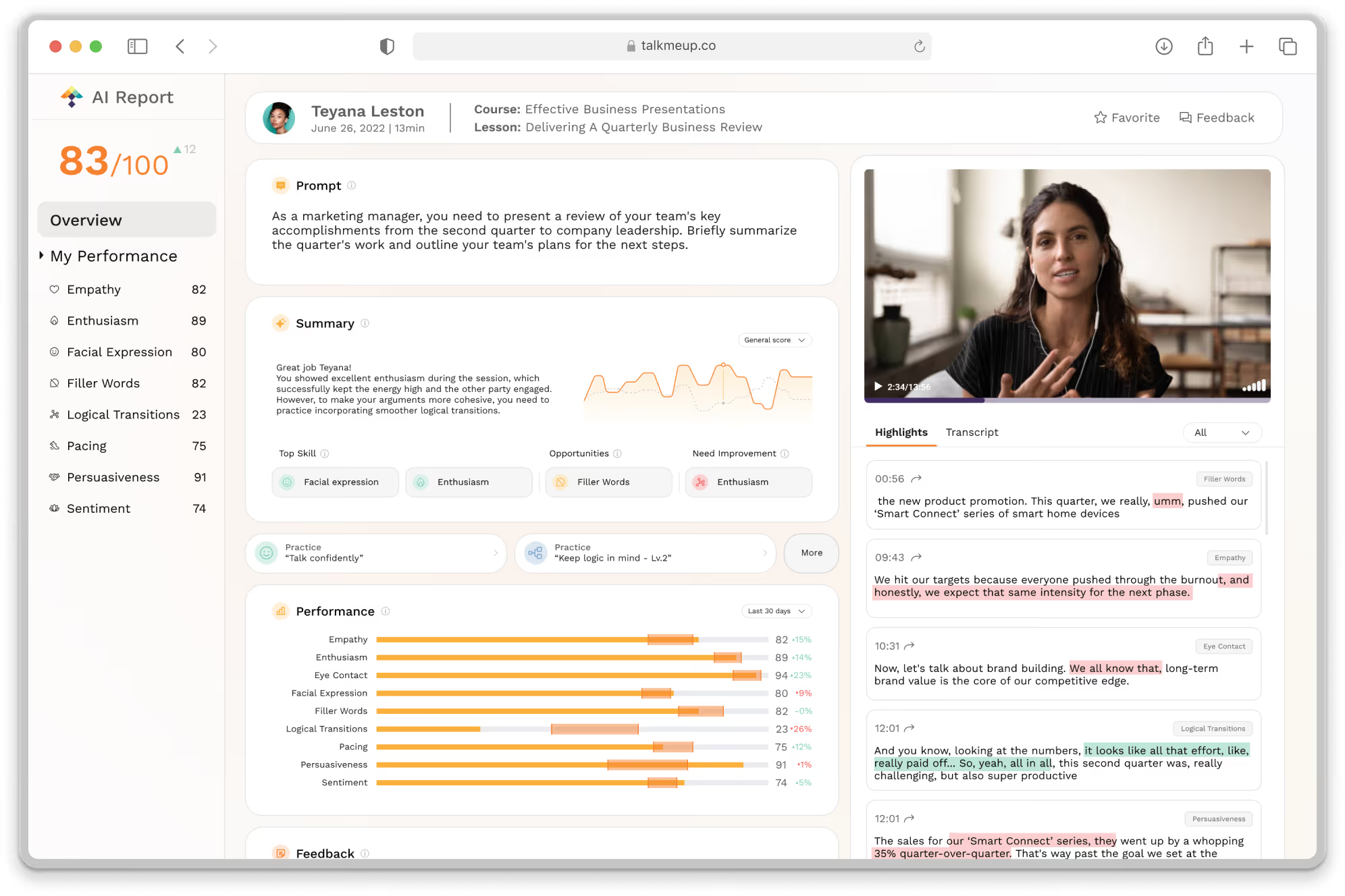
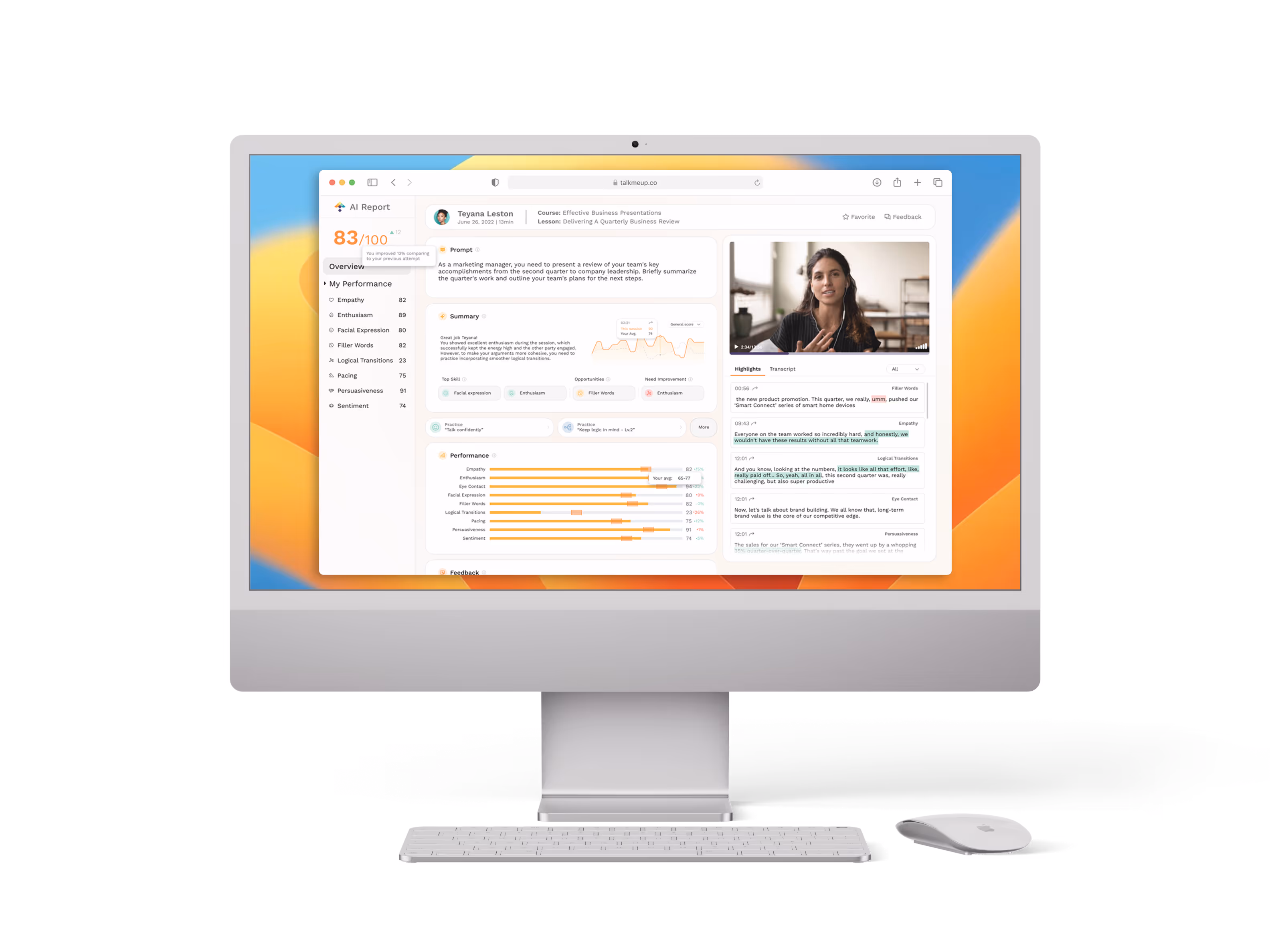
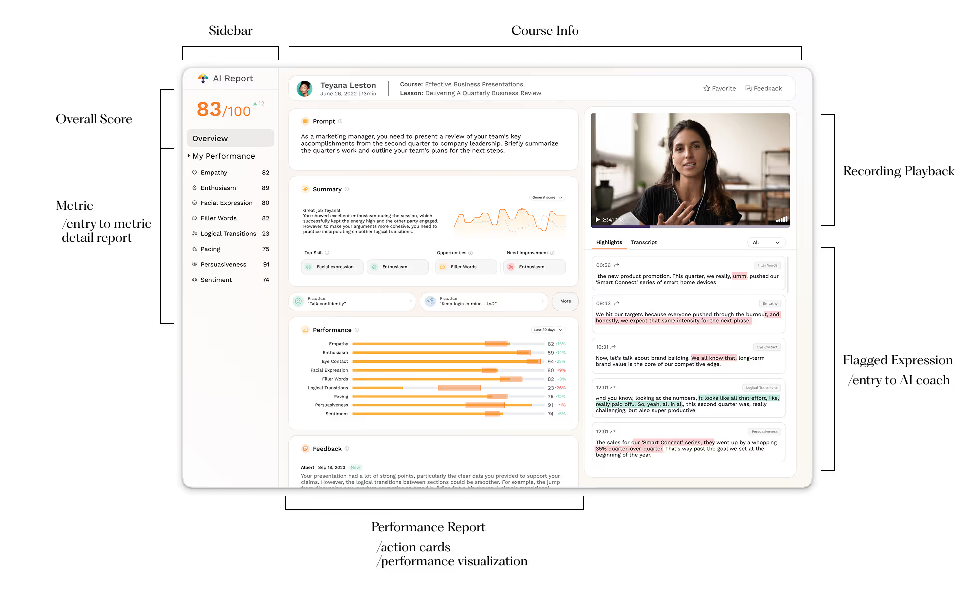
I rebuilt the report experience around a summary-first layout. Key takeaways and action promptions sit at the top, with details revealed on demand.
Classifying information into summary-type and review-type categories keep users oriented as they move between evidence and actions.
/02
Context in Recording
Every flagged line in the report links to the exact video moment. Click to auto-scroll and play the snippet (with a quick preview on hover), so users can verify why it was flagged without hunting through the recording.
Pairing guidance with the real footage, users see the surrounding context and tone, making the AI’s suggestions clearer, more relatable, and ultimately more trustworthy.
/03
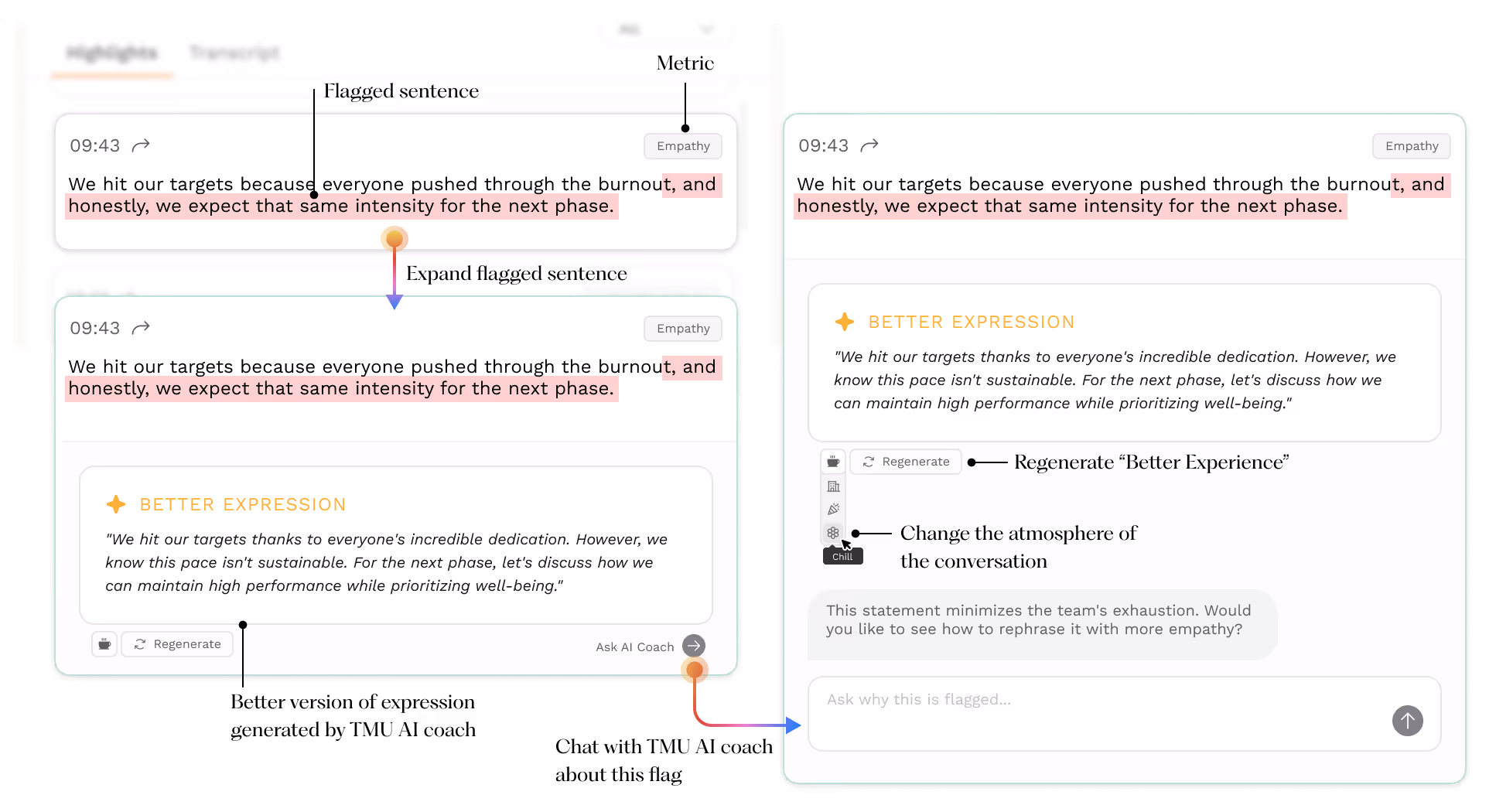
Better Expressions
Users can review and examine the flagged expressions in the transcript. View the improved phrasing suggestions provided by TMU AI based on different conversational contexts.
By conversing with the AI coach, users can gain a better understanding of how to refine their online communication skills.
/04
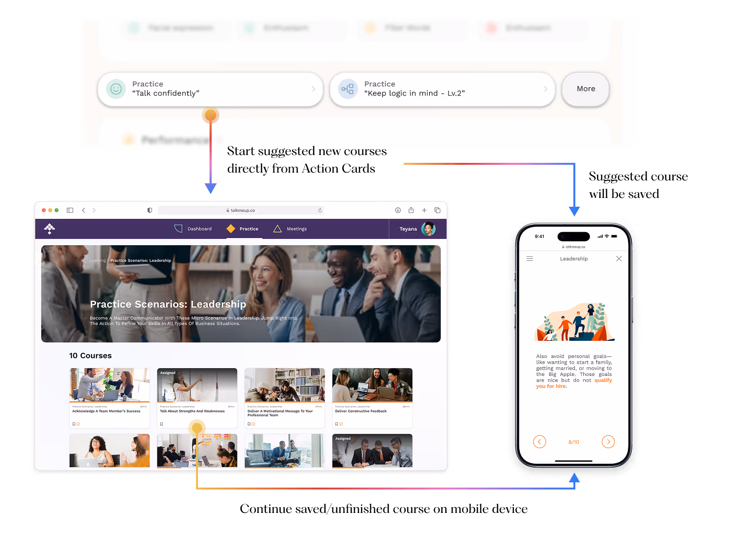
Action Cards
Action cards turn review into practice in seconds. By analyzing this recording, we pinpoint the most relevant course module and surface it with a one-tap Start practice CTA.
The card cuts through the noise, surfaces the key takeaway, and points straight to the right course, making improvement obvious and immediate.
Outcome
The impace I delivered
The redesign shifted behavior from reading to practicing. Users land on a summary-first view with a personal average and skill deltas to see exactly where they stand; flags link transcript lines to the precise clip, making the “why” behind each insight tangible.
For high-impact moments, AI coach offers phrasing tailored to role, audience, tone, and goal, while action cards route directly to the most relevant course module for a short drill. The result is a tighter learning loop: users act sooner, practice with motivation, and improve with intention.
Users felt “seen” and guided.
Pilot feedback highlighted clarity and usefulness, with CSAT up +35% and a 4.6/5 helpfulness rating for AI suggestions.
Flow, simplified.
The path from opening a report to taking action shrank from 6→2 steps; time-to-first-action dropped to <45s, page switches fell –60%.
Trust that scales coaching.
31% launched the recommended course from action cards; 19% finished that module within 48 hours.
Coming soon...


